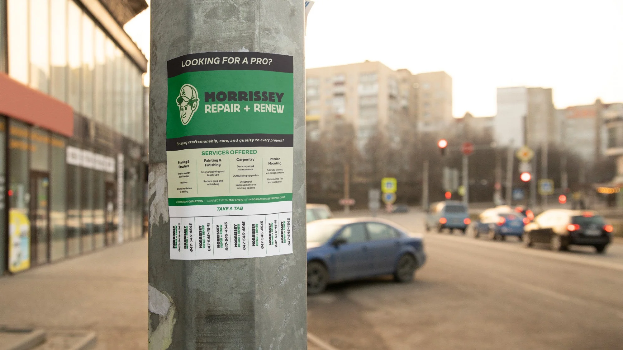
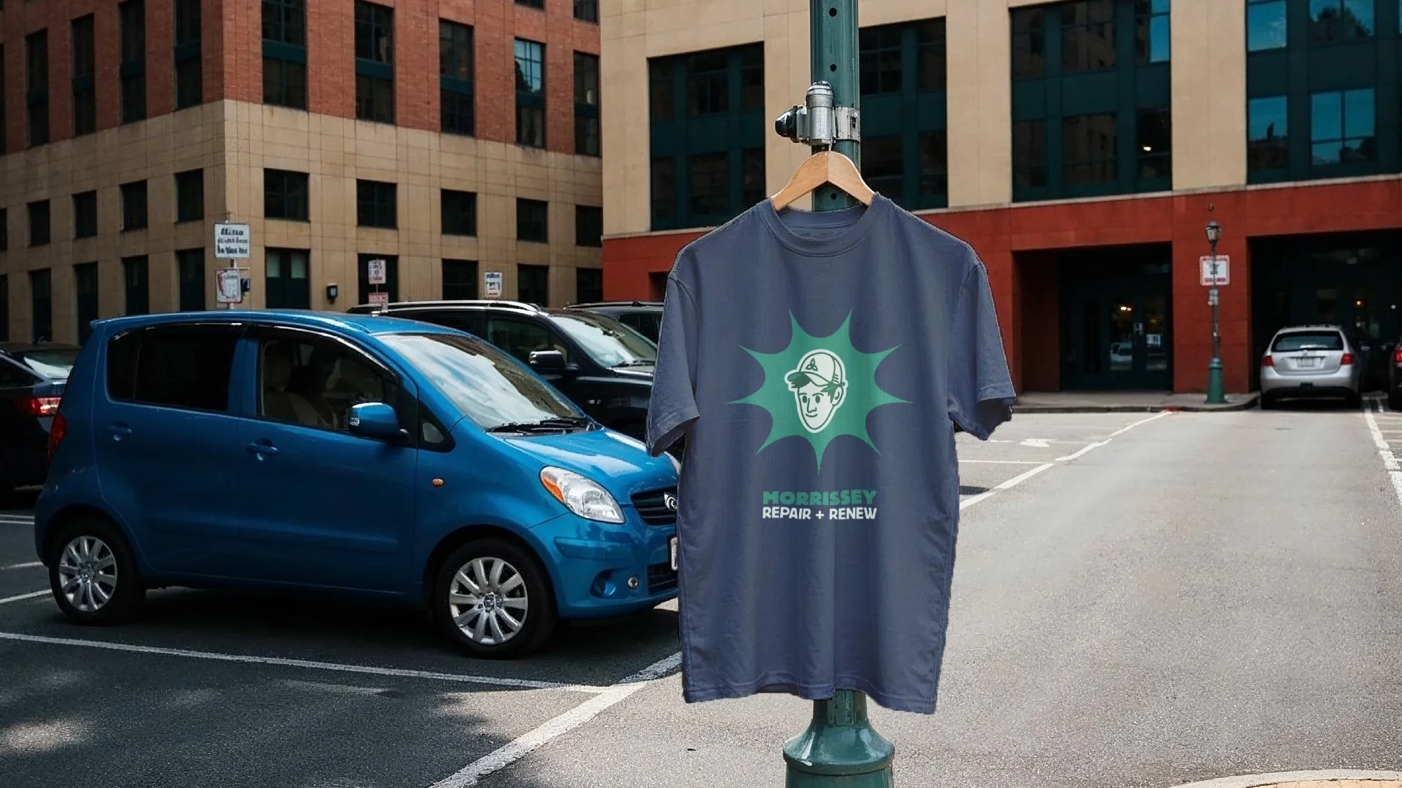
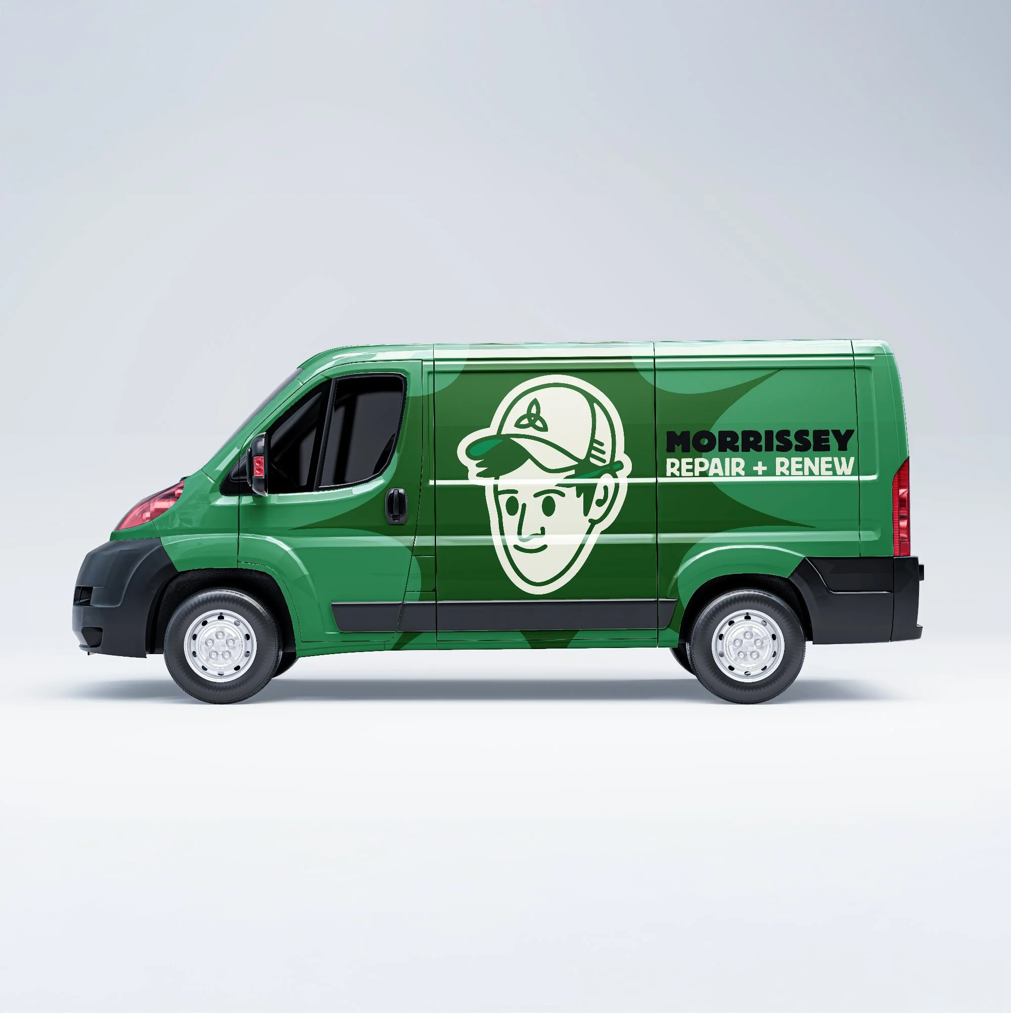
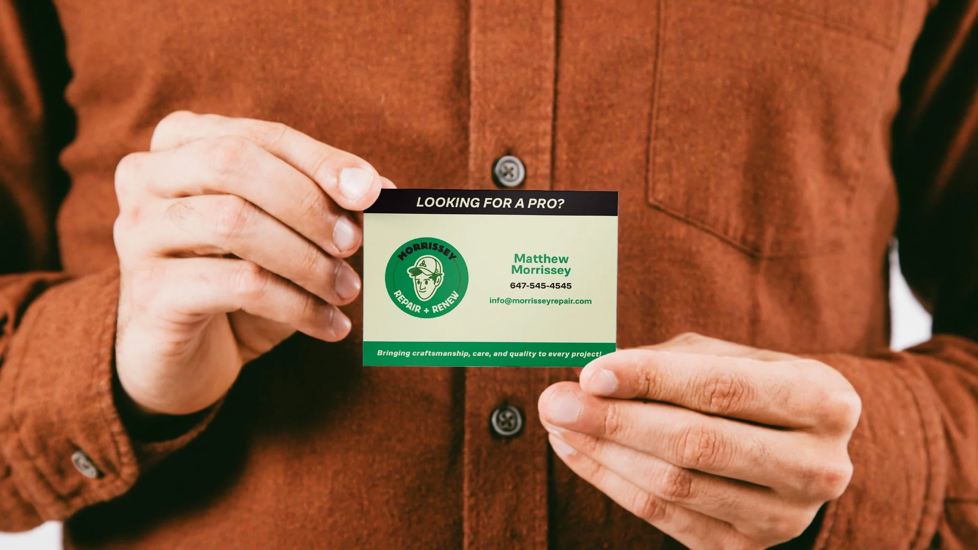
Morrissey Repair + Renew needed an identity that communicated skill, trust, and longevity...the kind of brand that shows up on a van, a flyer, and a chest pocket with equal conviction.
The challenge was avoiding the generic toolkit-and-wrench visual language that plagues the trades industry. The goal was something prouder: a mark that could stand on its own as a piece of graphic design, not just a business card.
The resulting system threads together a strong wordmark, restrained colour palette, and considered application across print and physical touchpoints.