Collective Arts Brewing
Collective Arts Brewing
Context
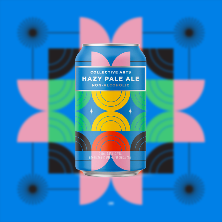
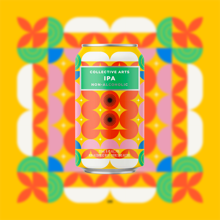
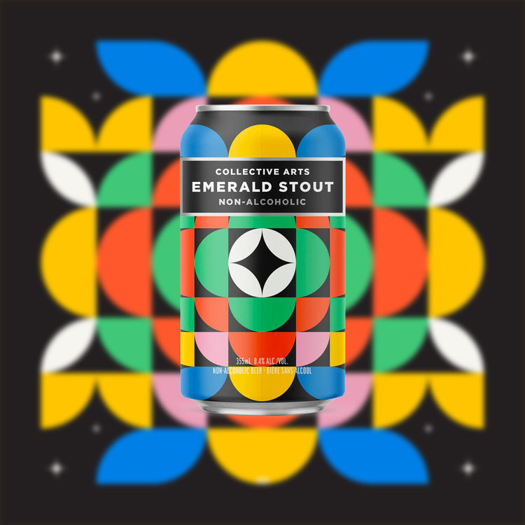
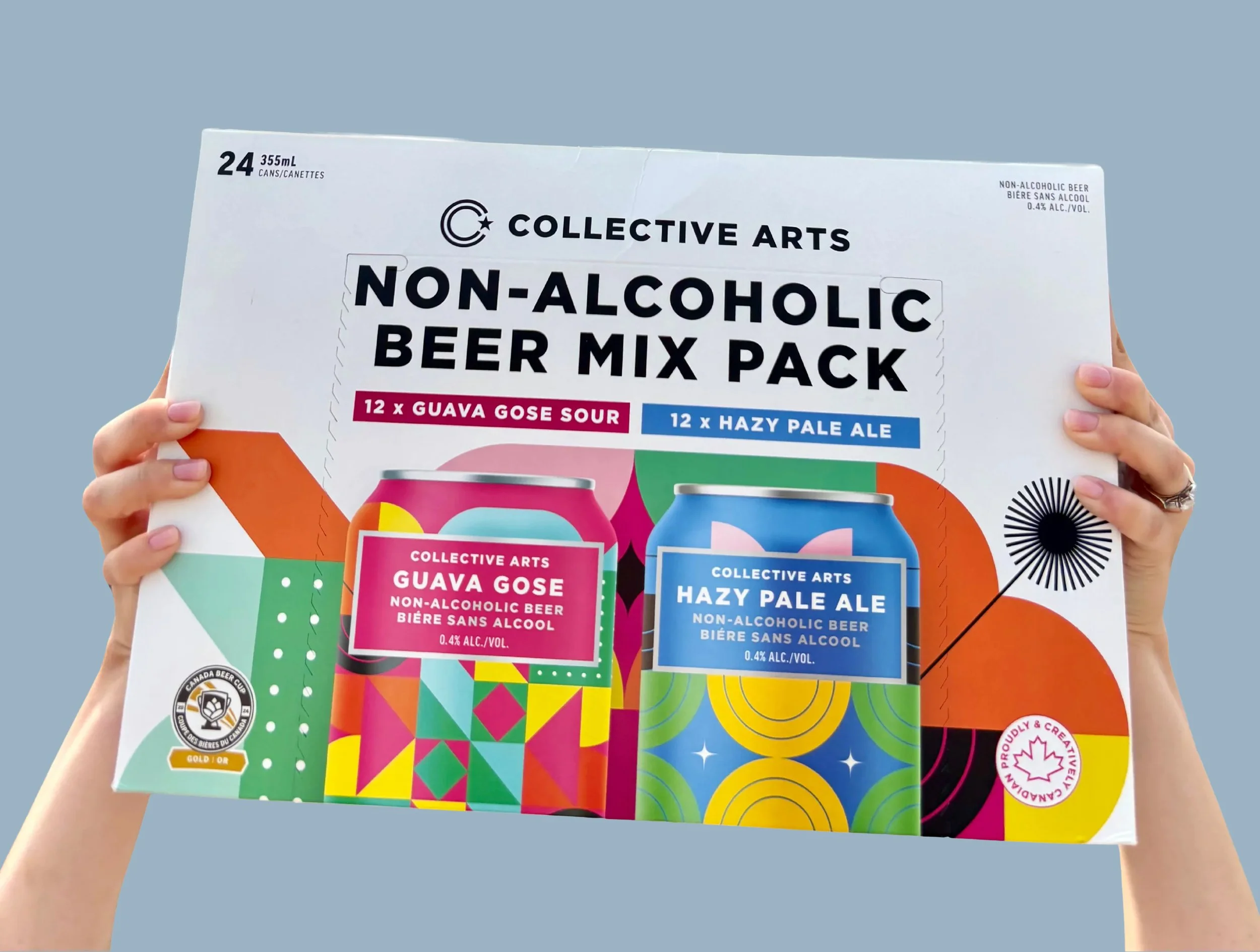
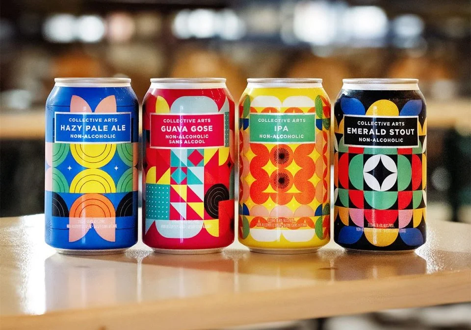
Collective Arts built their brand on the intersection of craft beer and independent art — a concept that's easy to say and hard to execute consistently at scale. They needed a visual system for a line of non-alcoholic beers that could hold its own on a crowded shelf, translate across packaging, apparel, and print, and feel cohesive without feeling corporate.
Process
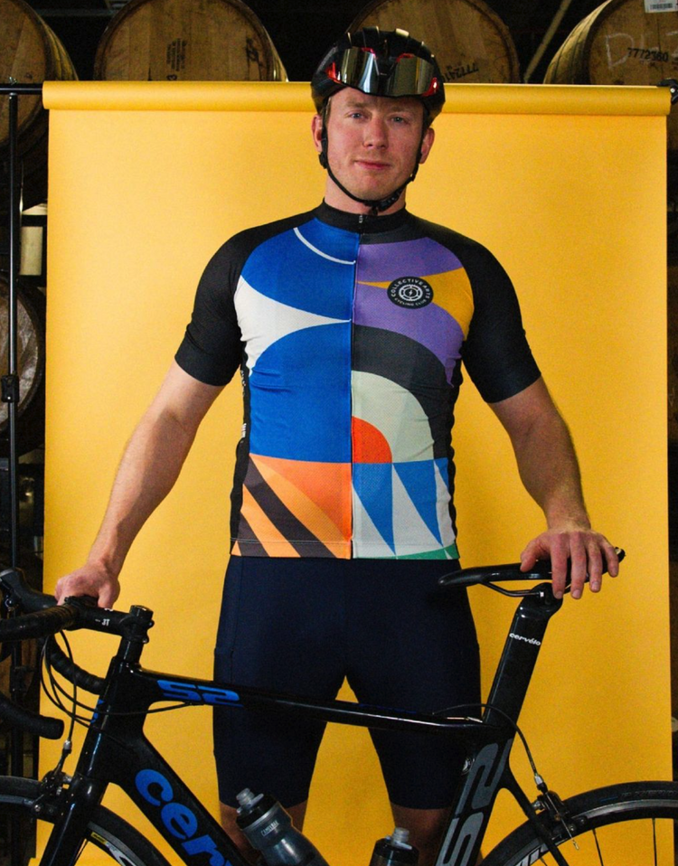
The solution was a bold geometric system built around strong, modular forms — the kind of visual language that works at can-label scale and expands naturally to cycling kit or poster format without losing energy. The geometry gave the work structure and repeatability; the colour palettes and compositional choices kept it from feeling cold or mechanical.